Clustering the trained prompts to try to extract the different classes
Published
May 7, 2021
I’ve been trying to visualize the separation of the different classes but it has been going very badly. The classes look completely intermingled, even for the prompt that classifies them with 92% accuracy. I feel like the problem is with the techniques that I have been using to separate them instead of the existence of separation.
The main approaches that I want to take are PCA, t-SNE, Umap, and KMeans. I’ll see if there is anything else.
Dataset
To start with I need the dataset. This is really made of two parts - the prompt and then the converted validation rows. Since I want to use this many times and do quite a bit of conversion over it, I am going to create a full dataframe from it.
So to do this I need quite a bit of code from the previous posts. First, the pytorch dataloader
Code
#collapsefrom typing import Dict, Iterator, Optional, Tuple, Unionimport pandas as pdimport torchfrom transformers import AutoModelForCausalLM, AutoTokenizerPast = Tuple[Tuple[torch.Tensor, ...], ...]TextBatch = Dict[str, torch.Tensor]PastBatch = Dict[str, Union[torch.Tensor, Past]]class TextDataloader:"""Provides a dataloader over a text dataframe"""def__init__(self, df: pd.DataFrame,*, tokenizer: AutoTokenizer, batch_size: int, max_length: int, device: torch.device = torch.device("cuda"), ) ->None:self.tokenizer = tokenizerself.df = dfself.batch_size = batch_sizeself.max_length = max_lengthself.device = devicedef__iter__(self) -> Iterator[TextBatch]:"""Returns an iterator that returns batches. The final batch can be a partial batch.""" df =self.df batch_size =self.batch_sizefor i inrange(len(self)): start = i * batch_size end = start + batch_sizeyieldself.to_batch(df[start:end])def__len__(self) ->int:"""Returns the total number of batches that can be returned.""" full_batches =len(self.df) //self.batch_sizeiflen(self.df) %self.batch_size:return full_batches +1return full_batchesdef to_batch(self, rows: pd.DataFrame) -> TextBatch:"""Converts the rows into a batch""" tokens =self.tokenizer( rows.text.tolist(), return_tensors="pt", padding=True, truncation=True, max_length=self.max_length, ).to(self.device)return {"input_ids": tokens["input_ids"],"attention_mask": tokens["attention_mask"], }class PastDataloader(TextDataloader): # pylint: disable=too-few-public-methods"""Provides a dataloader which converts the text into past tensors"""def__init__(self, df: pd.DataFrame,*, model: AutoModelForCausalLM, tokenizer: AutoTokenizer, batch_size: int, max_length: int, device: torch.device = torch.device("cuda"), ) ->None:super().__init__( df=df, tokenizer=tokenizer, batch_size=batch_size, max_length=max_length, device=device, ) model.to(device)self.model = model@torch.no_grad()def to_batch(self, rows: pd.DataFrame) -> PastBatch: batch =super().to_batch(rows) past_key_values =self.model( input_ids=batch["input_ids"], attention_mask=batch.get("attention_mask", None), ).past_key_valuesreturn {"past_key_values": past_key_values,"attention_mask": batch["attention_mask"], }
Now we can have the code that passes the text and prompt through the model
Code
#collapsefrom tqdm.auto import tqdm@torch.no_grad()def generate_outputs( dl: PastDataloader, model: AutoModelForCausalLM, prompt: torch.Tensor, use_lm_head: bool=True,) -> Iterator[Tuple[torch.Tensor, torch.Tensor]]: prompt_attention = torch.ones((1, prompt.shape[1]), device=dl.device)for batch in tqdm(dl): output = _get_output_with_past( model=model, prompt=prompt, attention_mask=prompt_attention, past=batch["past_key_values"], past_attention_mask=batch["attention_mask"], )if use_lm_head: output = model.lm_head(output) output = output[:, -1]for row in output.cpu().numpy():yield row[None, :]def _get_output_with_past(*, model: AutoModelForCausalLM, prompt: torch.nn.Parameter, attention_mask: torch.Tensor, past: Past, past_attention_mask: torch.Tensor,) -> torch.Tensor:"""Get the predictions for the next token after the prompt"""# concatenate the past attention with the prompt attention batch_size = past_attention_mask.shape[0] attention_mask = attention_mask.repeat_interleave(batch_size, dim=0) attention_mask = torch.cat([past_attention_mask, attention_mask], dim=-1)# expand the prompt to match the batch size input_ids = prompt.repeat_interleave(batch_size, dim=0)return model.transformer( inputs_embeds=input_ids, attention_mask=attention_mask, past_key_values=past, ).last_hidden_state
Now we can generate the two datasets - one for the raw output of the underlying model, and one that translates that through the language model. These datasets are not shuffled so they are aligned with the original dataframe labels.
Code
from pathlib import Pathimport numpy as npDATA_FOLDER = Path("/data/blog/2021-05-07-different-clustering-approaches")original_prompt = torch.load("/data/blog/2021-04-28-imbd-prompt-training/trained-prompt-1-20-768.pt")# The underlying model outputsoutputs = np.concatenate(list(generate_outputs( dl=validation_dataloader, model=model, prompt=original_prompt, use_lm_head=False, )))np.save( DATA_FOLDER /"original-prompt-model-good.npy", outputs[validation_df.label =="good"])np.save( DATA_FOLDER /"original-prompt-model-bad.npy", outputs[validation_df.label =="bad"])
Code
from pathlib import Pathimport numpy as npDATA_FOLDER = Path("/data/blog/2021-05-07-different-clustering-approaches")original_prompt = torch.load("/data/blog/2021-04-28-imbd-prompt-training/trained-prompt-1-20-768.pt")# The output associated with explicit tokensoutputs = np.concatenate(list(generate_outputs( dl=validation_dataloader, model=model, prompt=original_prompt, use_lm_head=True, )))np.save( DATA_FOLDER /"original-prompt-lm-good.npy", outputs[validation_df.label =="good"])np.save( DATA_FOLDER /"original-prompt-lm-bad.npy", outputs[validation_df.label =="bad"])
So these datasets are large and loading the model has used quite a bit of memory. For each of these I will be loading the data from disk to allow me to restart this notebook as required. I’m going to be using the sklearn versions of the different dimensionality reduction techniques. The aim will be to produce a visualization that separates the two classes.
Ideally this would be achieved without guidance, as the data is separate - this dataset is 92% correctly separated. We can actually demonstrate this.
Data Separation
This data isn’t difficult to separate. We know that the model produces the “good” or “bad” output for the different sentiment classes. So the outputs are separated. To demonstrate this we can just check the number of correctly classified rows in each of the datasets.
Code
from pathlib import Pathimport numpy as npDATA_FOLDER = Path("/data/blog/2021-05-07-different-clustering-approaches")GOOD_TOKEN =11274BAD_TOKEN =14774good_output = np.load(DATA_FOLDER /"original-prompt-lm-good.npy")bad_output = np.load(DATA_FOLDER /"original-prompt-lm-bad.npy")
So as we can see it is 92% accurate for both good and bad labels.
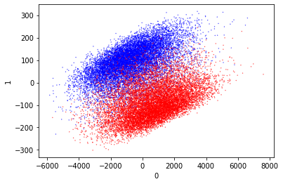
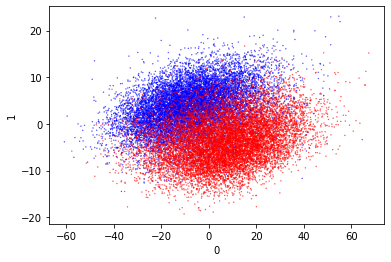
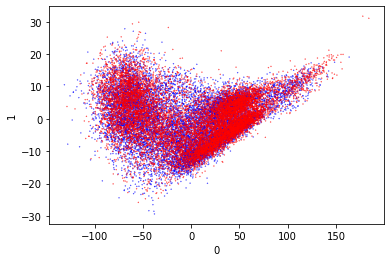
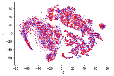
Principle Component Analysis (PCA)
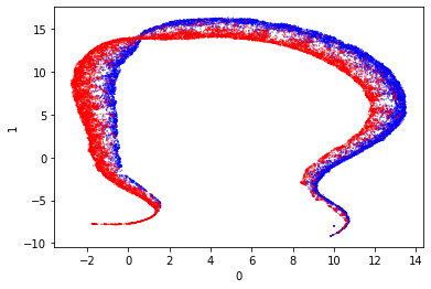
So to start with we can try PCA again. This did not separate the classes well before. I think it’s good to include this in the different visualization techniques so we can compare them easily.
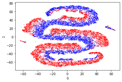
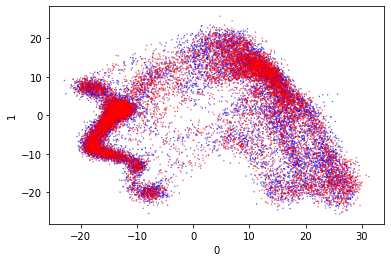
This technique does more to separate the different clusters according to their proximity in the original space. From wikipedia:
It models each high-dimensional object by a two- or three-dimensional point in such a way that similar objects are modeled by nearby points and dissimilar objects are modeled by distant points with high probability.
So this should produce visually separate clusters. It will be interesting to see if these clusters correspond to the dataset classes.
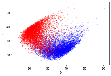
These are very pretty and they also separate the data really well. I especially like the second one, as it has naturally separated the outputs well. There is a small amount of mixing but it’s really very limited.
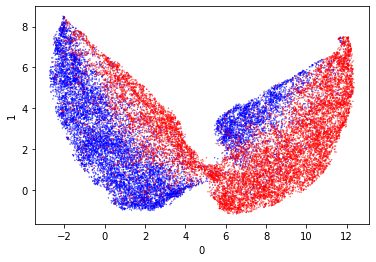
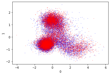
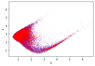
KMeans
This is both a way to visualize the classes and classify them. If I can use this to reconstruct the classes then this would be a way to classify the output of the model.
That looks really odd. I wonder why it is shaped like that. Since it doesn’t appear to cleanly separate the classes I am not confident about the predictions that this will make.
Anyway it should be possible to predict the clusters over this. I don’t know which cluster index will be assigned to good or bad, so I need to just take the majority cluster for each.
These numbers are very similar, and indicate a roughly \(\frac{2}{3}\) correct classification. This is very poor compared to the simple split between the good and bad tokens. So KMeans is not demonstrating a strong ability to split the clusters. The default cluster count is
While it’s slightly better with more clusters it’s still not 92% accurate. Using KMeans loses accuracy.
This isn’t a huge surprise given the very strange visualization. It suggests to me that KMeans is the wrong dimensionality reduction technique for this.
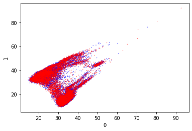
Normalized KMeans
One thing about kmeans is that it uses a measure of distance. If the different dimensions vary heavily in magnitude then they could lead to the bad clustering. Maybe some kind of normalization of the data could help?
Code
from sklearn.preprocessing import StandardScalerscaled_lm_output = StandardScaler().fit_transform(lm_output)scaled_model_output = StandardScaler().fit_transform(model_output)
The kmeans results after scaling the model output look promising. What concerns me is that the dividing line does not appear to lie along the axis, to my eye it looks slightly offset. I feel that this could account for quite a lot of the misclassifications.
Anyway lets see how well it predicts the scaled model output.
This incurs about a 2% accuracy loss for good classifications. That’s better than I was expecting. So normalizing the data improves the accuracy of the cluster classification, but it’s not as good as the direct token comparison.
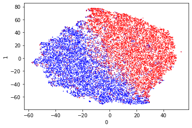
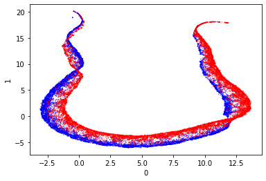
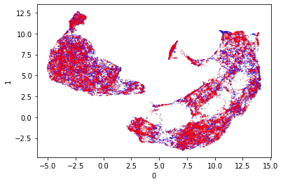
Uniform Manifold Approximation and Projection for Dimension Reduction (UMap)
This is a dimensionality reduction technique that is not part of sklearn (documentation). Someone at work suggested this as a way to do dimensionality reduction over this dataset (thank you!). Apparently it has a way to guide the separation based on the classes of the different entries.
After scaling the model output separates quite nicely with UMap. It appears that the data separates around 5 on axis 0. I’m quite entertained by the streamer style projections as a similar shape was also produced by t-SNE. I don’t think such streamers are easy to separate.
Retrained Prompt Visualization
So these visualization techniques have done really well with the token trained prompt. The underlying reason that I wanted to visualize the output of the prompt was because I had trained two prompts in more of a semantic way. I thought that the visualization and clustering of the outputs of the semantic training would show if it had worked without tying it to a specific token.
So I am going to visualize the cosine similarity trained prompt as well as the distance trained prompt. I have trained these on both the raw model output and the token output, so we can even evaluate those against each other. Let’s see if they separate.
The first thing to do is to generate the datasets for the clustering.
Code
from pathlib import Pathimport numpy as npDATA_FOLDER = Path("/data/blog/2021-05-07-different-clustering-approaches")cosine_model_prompt = torch.load("/data/blog/2021-05-04-prompt-training-clustering/trained-prompt-1-20-768-cosine.pt")# The underlying model outputsoutputs = np.concatenate(list(generate_outputs( dl=validation_dataloader, model=model, prompt=cosine_model_prompt, use_lm_head=False, )))np.save( DATA_FOLDER /"cosine-model-prompt-good.npy", outputs[validation_df.label =="good"])np.save( DATA_FOLDER /"cosine-model-prompt-bad.npy", outputs[validation_df.label =="bad"])
Code
from pathlib import Pathimport numpy as npDATA_FOLDER = Path("/data/blog/2021-05-07-different-clustering-approaches")distance_model_prompt = torch.load("/data/blog/2021-05-04-prompt-training-clustering/trained-prompt-1-20-768-distance.pt")# The underlying model outputsoutputs = np.concatenate(list(generate_outputs( dl=validation_dataloader, model=model, prompt=distance_model_prompt, use_lm_head=False, )))np.save( DATA_FOLDER /"distance-model-prompt-good.npy", outputs[validation_df.label =="good"])np.save( DATA_FOLDER /"distance-model-prompt-bad.npy", outputs[validation_df.label =="bad"])
Cosine Similarity - PCA
The first bit of training was with cosine similarity loss and the raw model output. This seemed to train quite poorly as the loss barely changed during training. Let’s see how that fares with PCA.
from sklearn.preprocessing import StandardScalerimport numpy as npimport pandas as pdmodel_output = np.concatenate([ np.load(DATA_FOLDER /"distance-model-prompt-good.npy"), np.load(DATA_FOLDER /"distance-model-prompt-bad.npy"),])validation_df = pd.read_parquet(DATA_FOLDER /"validation.gz.parquet")scaled_model_output = StandardScaler().fit_transform(model_output)
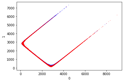
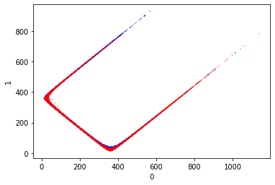
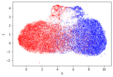
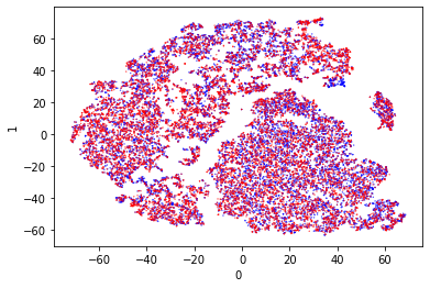
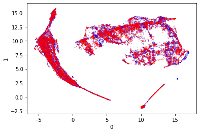
Distance Similarity - PCA
The second loss was the distance between the points. This time the loss changed quite dramatically. My concerns with this training is the relative weight between the loss for different classes and the loss for the same class.
These both look terrible. The clustering looks extremely similar to the original clustering that was observed in the training run. This leads me to believe that I was using PCA correctly, and that the results were bad.
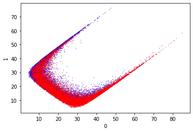
I’m going to run the other clustering methods over the distance trained dataset for completeness.
I don’t think it’s a wild surprise that all of these visualizations are poor. I feel like the core problem is the loss function. That needs to be revisited - first by checking that it works at all, and then by retraining. It’s great to see that the visualization techniques work though.