Cross Language Prompt Internalization - Synonym Clustering Visualization
Visualizing the different clustering metrics
prompt internalization
multilingual prompt internalization
cross language word sense induction
Published
July 24, 2022
The separation of the two sentences for target was evaluated recently. That showed that the dot product or distance metric works well, as does cosine similarity.
Testing a metric on two values does not establish any kind of proof of what metric is the best. I want a metric that can clearly separate the word meanings in a reliable way. Given that there is a large number of article features available I can try to visualize them and run the different metrics over them to see which ones match the underlying distribution.
I’m going to do this by combining the recent efforts. Using DBSCAN to identify the core feature points for an article and calculating a centroid from them. Then using this centroid to calculate a distance like metric.
Preparation
This is mainly about the visualization so let’s get everything we need beforehand out of the way first.
Code
I’ve split the code out into smaller methods that can be composed as it was all getting quite unweildy by the end of the last post.
Since I have to deal with a “sparse” (non-sparse but indexed) matrix for memory reasons the first thing is to be able to map between different indices. The expand_compact method can generate the minimum matrix for a given set of probabilities and indices. The expand_match method can generate a matrix that matches the target indices from a set of probabilities and indices.
Code
# from src/main/python/blog/prompt_internalization/clustering/expand.pyimport numpy as npimport pandas as pddef expand( probabilities: np.ndarray, indices: np.ndarray, size: int=250_002) -> np.ndarray:"""Expand the indicies and probabilities for a single row to the full 250k tokens""" result = np.zeros(shape=size) result[indices] = probabilitiesreturn resultdef expand_all( probabilities: np.ndarray, indices: np.ndarray, size: int=250_002) -> np.ndarray:"""Expand the indicies and probabilities for several rows to the full 250k tokens""" rows = probabilities.shape[0] result = np.zeros(shape=(rows, size)) result.flat[indices + (size * np.arange(rows)[:, None])] = probabilitiesreturn resultdef expand_compact(df: pd.DataFrame) -> (np.ndarray, np.ndarray):"""Expand the indicies and probabilities for several rows to the minimum number of tokens. Returns the indices used so the process can be repeated.""" unique_tokens = np.sort(df["index"].explode().unique()) token_map = {token_index: index for index, token_index inenumerate(unique_tokens)} rows =len(df) token_count =len(unique_tokens)def map_tokens(tokens: list[int]) ->list[int]:returnlist(map(token_map.get, tokens)) token_index = np.array(df["index"].apply(map_tokens).tolist()) probability = np.zeros((rows, token_count)) probability.flat[token_index + (token_count * np.arange(rows)[:, None])] = np.array( df.probability.tolist() )return (probability, unique_tokens)def expand_match( probability: np.ndarray, probability_indices: np.ndarray, target_indices: np.ndarray) -> np.ndarray:"""Expand the indexed probability matrix to match the target indices. Missing values are filled with zero.""" rows = probability.shape[0] columns = target_indices.shape[0] result = np.zeros(shape=(rows, columns))# the indices of values in probability that are in target p_indices = np.where(np.in1d(probability_indices, target_indices))[0]# the indices of values in target that are in probability t_indices = np.where(np.in1d(target_indices, probability_indices))[0]# a = np.array([1, 3, 5, 7, 9])# b = np.array([3, 4, 5, 6, 7])# np.where(np.in1d(a, b))[0]# >> array([1, 2, 3])# this is the array of values in a that are also present in b:# a[[1, 2, 3]]# >> array([3, 5, 7]) result[:, t_indices] = probability[:, p_indices]return result
The filtering using DBSCAN uses the same approach as before:
Calculate the minimum samples based on a ratio of the total number of samples, use this as min_samples
Calculate the 75th quantile distance that encompasses this many samples, use this as eps
Run DBSCAN over the points
Find the majority cluster and return only points within that
Code
# from src/main/python/blog/prompt_internalization/clustering/dbscan.pyimport numpy as npimport pandas as pdfrom sklearn.cluster import DBSCANfrom sklearn.neighbors import NearestNeighborsclass DBSCANFilter:""" This filters the points to those that would be considered part of the majority DBSCAN cluster. """def__init__(self, min_samples_ratio: float) ->None:self.min_samples_ratio = min_samples_ratioself.dbscan =Noneself.label =Nonedef fit_transform(self, probability: np.ndarray) -> np.ndarray:self.fit(probability) mask =self.transform(probability)return probability[mask]def fit(self, probability: np.ndarray) ->None: min_samples =max(1, int(probability.shape[0] *self.min_samples_ratio)) neighbors = NearestNeighbors(n_neighbors=min_samples) neighbors.fit(probability) neighbor_distance, _ = neighbors.kneighbors( X=probability, n_neighbors=min_samples )# 75% quantile distance that encompasses all min_samples points median_eps = np.quantile(neighbor_distance[:, -1], 0.75)self.dbscan = DBSCAN(eps=median_eps, min_samples=min_samples)self.dbscan.fit(probability) labels = pd.Series(self.dbscan.labels_) labels = labels[labels !=-1]self.label = labels.value_counts().index[0]def transform(self, points: np.ndarray) -> np.ndarray:assertself.dbscan isnotNone, "call fit first" point_count = points.shape[0] result = np.ones(shape=point_count, dtype=int) *-1for i inrange(point_count): difference =self.dbscan.components_ - points[i, :] distance = np.linalg.norm(difference, axis=1) closest_idx = np.argmin(distance)if distance[closest_idx] <self.dbscan.eps: result[i] =self.dbscan.labels_[self.dbscan.core_sample_indices_[closest_idx] ]return result ==self.label
The article description now can concern itself only with calculating metrics. All points provided must be mapped to the correct space beforehand. For efficiency this now only works over batches of points.
Code
# from src/main/python/blog/prompt_internalization/clustering/measure.pyfrom __future__ import annotationsfrom dataclasses import dataclassfrom typing import Optionalimport numpy as npfrom scipy.spatial.distance import cosine, euclideanfrom scipy.stats import norm@dataclassclass ArticleDescription: label: str indices: np.ndarray mean: np.ndarray std: np.ndarray@staticmethoddef make( label: str, probability: np.ndarray, indices: Optional[np.ndarray], minimum_count: int=5, ) -> ArticleDescription:if indices isNone: indices = np.arange(probability.shape[1])# drop any columns which do not have at least minimum_count values mask = (~np.isnan(probability)).sum(axis=0) >= minimum_count indices = indices[mask] probability = probability[:, mask] probability = np.nan_to_num(probability, nan=0.0) mean = np.mean(probability, axis=0) std = np.std(probability, axis=0) std[std ==0] = std[std !=0].min()return ArticleDescription( label=label, indices=indices.astype(int), mean=mean, std=std )def describe(self, point: np.ndarray) ->dict[str, float]:return {"cosine_unweighted": self.cosine_similarity(point),"cosine_weighted": self.cosine_similarity(point, weight=True),"distance_unweighted": self.distance(point),"distance_weighted": self.distance(point, weight=True),"dot_unweighted": self.dot(point),"dot_weighted": self.dot(point, weight=True),"log_p_mean": self.log_p(point).mean(),"log_p_min": self.log_p(point).min(), }def cosine_similarity(self, point: np.ndarray, weight: bool=False) ->float:"""Calculates the dot product between the point and the mean. This returns 0. for identical direction, 1 for orthogonal and 2 for opposite."""return np.array( [ cosine(row, self.mean, w=1/self.std if weight elseNone)for row in point ] )def distance(self, point: np.ndarray, weight: bool=False) ->float:"""Calculates the euclidean distance between the point and the cluster centroid."""return np.array( [ euclidean(row, self.mean, w=1/self.std if weight elseNone)for row in point ] )def dot(self, point: np.ndarray, weight: bool=False) ->float:"""Calculates the dot product between the point and the mean."""ifnot weight:return np.dot(point, self.mean)return np.sum(np.multiply(point, self.mean) /self.std)def log_p(self, point: np.ndarray, permutation: float=0.01) ->float:"""Calculates the log probability of this feature describing the provided point. The point values are assumed to come straight from the model without softmax being applied.""" left_cdf = norm.cdf( point - permutation, loc=self.mean, scale=self.std, ) right_cdf = norm.cdf( point + permutation, loc=self.mean, scale=self.std, ) local_probability = right_cdf - left_cdf# there can be points where the probability is zero# because they are that far out of the distribution local_probability[local_probability <=0] =1e-9return np.log(local_probability)
Plotting is now split between labelled plots to show things like the distribution of article link features, and continuous plots to show metric scores. The centroid for a cluster can be shown but I have found it hard to put that “on top” in the 3d projection.
Code
# from src/main/python/blog/prompt_internalization/clustering/plot.pyfrom typing import List, Optionalimport matplotlib.pyplot as pltimport numpy as npimport pandas as pdfrom mpl_toolkits.mplot3d import Axes3Ddef plot_2d( df: pd.DataFrame,*, targets: Optional[List[str]] =None, figure: plt.Figure =None, axes: plt.Axes =None, legend: bool=True, title: Optional[str] =None,) ->None:if (figure isNone) != (axes isNone):raiseAssertionError("figure and axes must both be set or both None")if figure isNone: figure, axes = plt.subplots(figsize=(12, 9))for group_name, group_idx in df.groupby("target").groups.items():if targets and group_name notin targets:continue axes.scatter(*df.iloc[group_idx, [0, 1]].T.values, s=0.1, label=group_name)if legend: axes.legend(markerscale=10)if title: axes.set_title(title)def plot_2d_scale( df: pd.DataFrame, value: pd.Series,*, figure: plt.Figure =None, axes: plt.Axes =None, colorbar: bool=True, colormap: str="viridis", size: float=0.1, centroid: Optional[np.ndarray] =None, title: Optional[str] =None,) ->None:if (figure isNone) != (axes isNone):raiseAssertionError("figure and axes must both be set or both None")if figure isNone: figure, axes = plt.subplots(figsize=(12, 9)) pos = axes.scatter(*df.iloc[:, [0, 1]].T.values, s=size, c=value, cmap=colormap)if centroid isnotNone: axes.scatter(*centroid.T, s=100.0, c="red")if colorbar: figure.colorbar(pos, ax=axes)if title: axes.set_title(title)def plot_3d( df: pd.DataFrame,*, targets: Optional[List[str]] =None, figure: plt.Figure =None, axes: plt.Axes =None, legend: bool=True, title: Optional[str] =None,) ->None:if (figure isNone) != (axes isNone):raiseAssertionError("figure and axes must both be set or both None")if figure isNone: figure = plt.figure(figsize=(12, 9)) axes = Axes3D(figure, auto_add_to_figure=False) figure.add_axes(axes)for group_name, group_idx in df.groupby("target").groups.items():if targets and group_name notin targets:continue axes.scatter(*df.iloc[group_idx, [0, 1, 2]].T.values, s=0.1, label=group_name)if legend: axes.legend(markerscale=10)if title: axes.set_title(title)def plot_3d_scale( df: pd.DataFrame, value: pd.Series,*, figure: plt.Figure =None, axes: plt.Axes =None, colorbar: bool=True, colormap: str="viridis", size: float=0.1, centroid: Optional[np.ndarray] =None, title: Optional[str] =None,) ->None:if (figure isNone) != (axes isNone):raiseAssertionError("figure and axes must both be set or both None")if figure isNone: figure = plt.figure(figsize=(12, 9)) axes = Axes3D(figure, auto_add_to_figure=False) figure.add_axes(axes)if centroid isnotNone: axes.scatter(*centroid.T, s=100.0, c="red", label="centroid") pos = axes.scatter(*df.iloc[:, [0, 1, 2]].T.values, s=size, c=value, cmap=colormap, )if colorbar: figure.colorbar(pos, ax=axes)if title: axes.set_title(title)
Data Mangling
This is the application of all of that code. I’m going to run this evaluation against the democratic party label as that forms a separate cluster.
To perform the analyis I need a description of the democratic party cluster, as well as all the points in the dataset. Given that I have the indexed matrix representation I have to map the dataset points to the democratic party indices. I’ve included execution times to get an idea of how quickly this can be done.
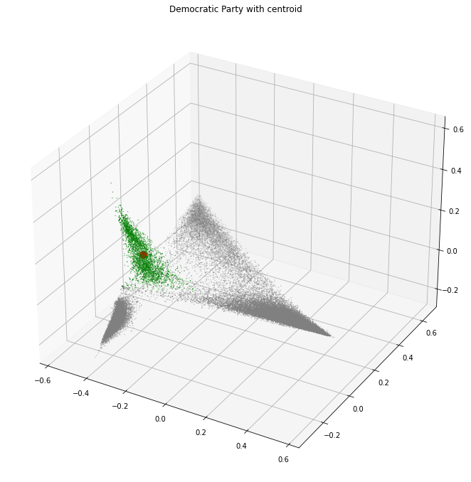
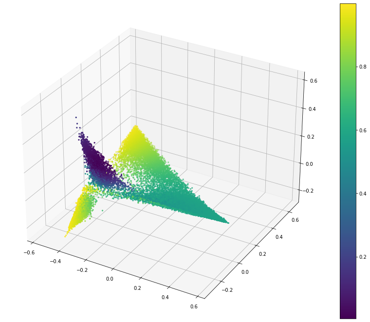
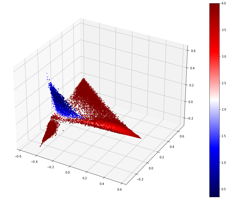
With all of that we can now review the different metrics. The first thing to see is what an ideal metric would identify, and where the centroid of the labelled features is.
Code
plot_3d_scale( df=pca_3d_df, value=(top_10_rows.target == label).map({True: "green", False: "grey"}), size=(top_10_rows.target == label).map({True: 0.1, False: 0.1}).tolist(), colorbar=False, centroid=pca_3d_centroid, title="Democratic Party with centroid",)
The democratic party features were chosen because they form a separate cluster. This allows the ideal metric to identify just this cluster and nothing else.
The metrics we will review are log probability, dot product, distance, cosine similarity, and distance with weighted dimensions.
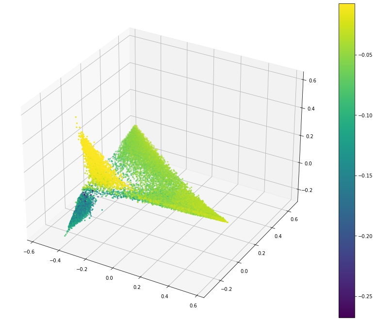
Log Probability
I wanted to use this because I thought it would be a way to measure if a proposed point is within the labelled cluster. The proposed way to calculate this is to assume that the token values assume a normal distribution. With this I can calculate the probability that a given point is within the labelled cluster by using the mean and standard deviation of each token in the point.
As different points have different tokens available I am taking the mean of these values rather than the sum, and excluding values that cannot be calculated (where one side lacks a value for the token). This would help with less comparable points in this dataset.
In this visualization a larger value (more yellow) is better.
This does identify the cluster consistently but the edges of the other clusters are also a strong match. I think this is due to the smaller number of comparable tokens. If there are only a few then they may have quite a good probability but the point is still quite distant in the global space.
So I think this is a poor metric.
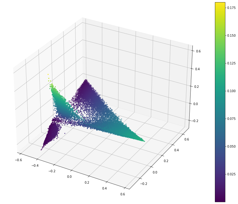
Dot Product
Here I am using dot product (pointwise multiplication of the centroid vector and the point, then sum the values). If the dot product score is high (more yellow) then the point is considered a good match for the cluster.
This is an improvement over the log probability as the city corner (top corner) is now low. The country corner (right corner) is still high. Another problem is that the democratic party points can end up with quite low scores near to the bottom.
So an improvement but not good enough.
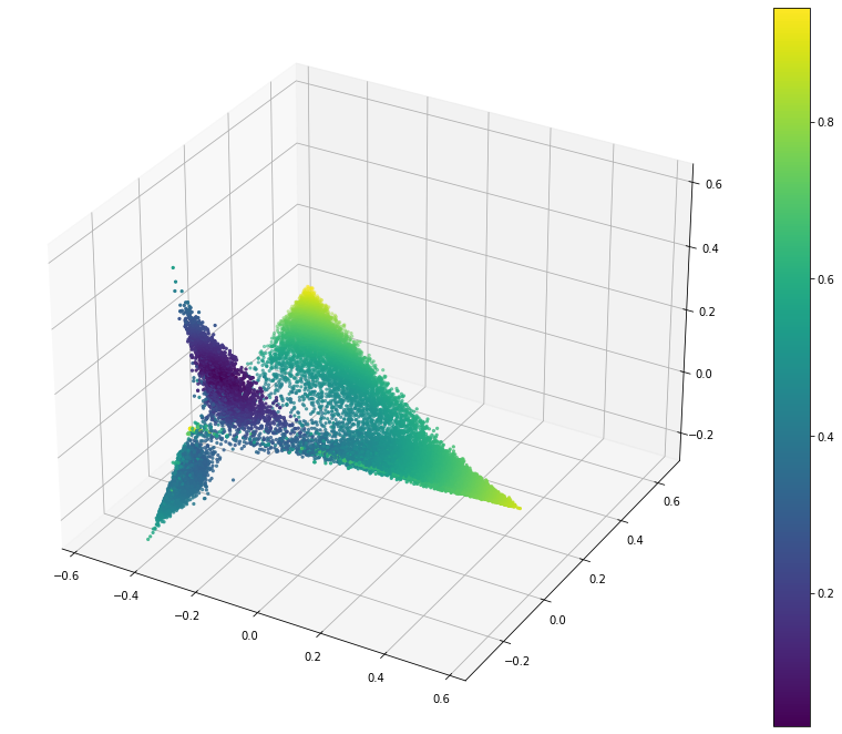
Distance
This measures the euclidean distance between the centroid of the democratic party points and the proposed point. The metric should increase smoothly as we move away from the centroid. There will be some sudden changes due to the nature of dimension reduction.
In this visualization lower (more blue/purple) is better as that means the point is closer to the centroid.
This is a much better result as the democratic party points look to be much closer than any other point. The city and country corners are considered far away.
This is great.
Cosine Similarity
Cosine similarity is the dot product over the normalized vectors. The normalization should counteract the outlier points that happened to make the city and country outliers perform strongly.
This is using the scipy cosine similarity where 0 means perfect alignment, 1 means orthogonal and 2 means opposite. That means that a lower score (more blue) is better.
A very strong showing with a stronger difference between the labelled points and all others. This is the strongest metric so far.
The problem I now have with this is determining the appropriate threshold to use. All of the points in this vary between 0 (alignment) and 1 (orthogonal).
I think that opposite points are impossible because of the use of softmax which ensures that all values are positive.
Weighted Distance
One way to think about the thresholding of these values is to imagine a spheroid that covers the labelled points. We can closely match the cluster by deforming the different dimensions, either by growing them or shrinking them.
In this case we are using the standard deviation of the points as the distance metric. That means that the spheroid will not be a unit spheroid (where a distance of 1 is the decision boundary) because 1 standard deviation covers about 68% of the values.
This has a really nice separating line between the democratic party points and all other points. The line was drawn by me by altering the threshold which allowed me to push it around as I saw fit.
A more systematic approach would be far better. This does give me confidence that such an approach could be performed.
Pointwise Mutual Information
It has been suggested that Pointwise Mutual Information might be a better factor to use for weighting the dimensions than the standard deviation. Calculating this should be quite easy.
One thing to be cautious about is including tokens that have too little supporting evidence, so I am going to keep only those tokens that occur some minimum number of times.
TODO This needs to compare the PMI for each token in the overall dataset to the PMI of the token in the label set (possibly the dbscan core points). Need some way to then calculate the PMI for the tokens in the proposed points and measure the distance scaling by that in some way, but the PMI can be negative.
label ="democratic party (united states)"pmi = token_pmi(probability_pmi[(top_10_rows.target == label).to_numpy()])pmi.shape
(3341, 1264)
pmi.argmax(axis=1).shape
(3341,)
pd.Series(pmi.argmax(axis=1)).value_counts()
1    3227
0      76
3      38
dtype: int64
I’m not really sure how to use these values. A negative PMI suggests that the actual value is less than we would expect. A positive PMI suggests that the actual value is more than we would expect.
TODO
Calculate these labels ahead of time
Calculate them for the unmapped space as well as the eigen space
Turn the first graph into a two label thing that clearly shows the points of interest (manual coloring)
Calculate the average metric crosstab (so average score on dot product for london against paris description)