Can the effect of an intervention be measured when the intervention is dependent on the measured value?
Published
October 11, 2023
My work colleague proposed a thought experiment to me. Imagine that we work at a school and want to tutor some of the children. We test the children and those that are doing well are selected for tuition. Maybe doing well here means they get 70% or more on the test.
How can we measure the value of the tuition? If we take the average score of the tutored children and untutored children on some future test and compare them then are we actually measuring the value of the tuition? The tutored children were selected because they scored highly in a previous test. All things being equal we would expect them to score highly in a future test too.
Regression discontinuity design is a way to investigate the results of an intervention to determine the average treatment effect. From wikipedia:
In statistics, econometrics, political science, epidemiology, and related disciplines, a regression discontinuity design (RDD) is a quasi-experimental pretest-posttest design that aims to determine the causal effects of interventions by assigning a cutoff or threshold above or below which an intervention is assigned. By comparing observations lying closely on either side of the threshold, it is possible to estimate the average treatment effect in environments in which randomisation is unfeasible. However, it remains impossible to make true causal inference with this method alone, as it does not automatically reject causal effects by any potential confounding variable.
We are going to investigate this.
Dataset
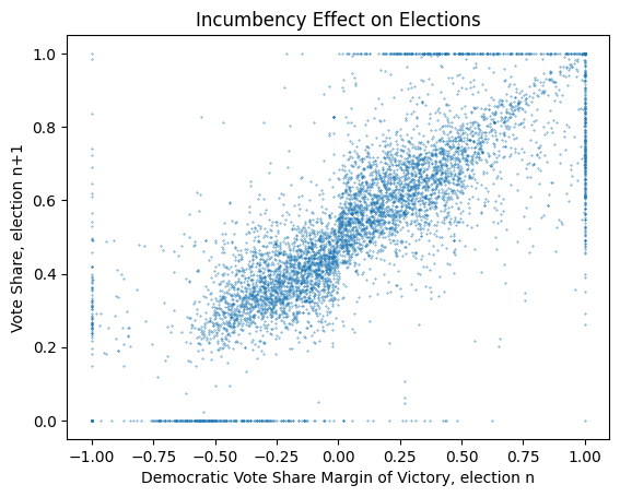
There is a dataset that plots the election result for the U.S. House (Lee 2008) (available here). The aim of the associated paper was to measure the electoral advantage of incumbency. In the paper this is described as:
Lee, David S. 2008. “Randomized Experiments from Non-Random Selection in u.s. House Elections.”Journal of Econometrics 142 (2): 675–97. https://doi.org/https://doi.org/10.1016/j.jeconom.2007.05.004.
the United States House of Representatives, in any given election year, the incumbent party in a given congressional district will likely win. The […] re-election rate is about 90% and has been fairly stable over the past 50 years.
There is a dataset that is associated with this paper, which is described in section 3.3 of the paper:
In virtually all Congressional elections, the strongest two parties will be the Republicans and the Democrats, but third parties do obtain some small share of the vote. As a result, the cutoff that determines the winner will not be exactly 50%. To address this, the main vote share variable is the Democratic vote share minus the vote share of the strongest opponent, which in most cases is a Republican nominee. The Democrat wins the election when this variable “Democratic vote share margin of victory” crosses the 0 threshold, and loses the election otherwise.
Incumbency advantage estimates are reported for the Democratic party only. In a strictly two-party system, estimates for the Republican party would be an exact mirror image, with numerically identical results, since Democratic victories and vote shares would have one-to-one correspondences with Republican losses and vote shares.
The x axis reports the vote share of the previous election from -1 (the vote was 100% to the strongest opponent) to 1 (the vote was 100% to the democratic candidate). The y axis is then the vote share of the next election. There are cases where a candidate runs unopposed, in this situation they receive 100% of the votes, which leads to a border around the graph.
We can see the raw data as a scatter plot:
Code
import pandas as pdimport matplotlibdef plot_results( df: pd.DataFrame, s: float=0.1, c: Optional[pd.Series] =None,) -> matplotlib.axes.Axes:if c isnotNoneand c.dtype.name =="bool": c = c.map({True: "green",False: "red", })return df.plot.scatter( x="x", y="y", s=s, c=c, title="Incumbency Effect on Elections", xlabel="Democratic Vote Share Margin of Victory, election n", ylabel="Vote Share, election n+1", )plot_results(pd.read_csv("lee2008.csv")) ;None
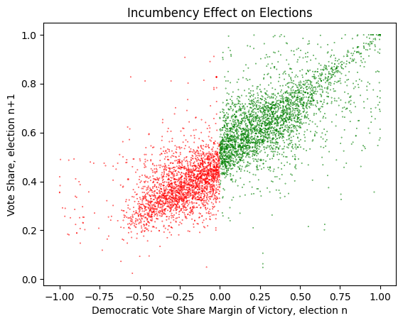
For our purposes the uncontested elections are not helpful, as the circumstance that lead to them is not what we are trying to predict. Therefore I am excluding these results from the dataset.
We are attempting to determine the incumbency effect, which is the influence that winning \(Election_n\) has on the probability of winning \(Election_{n+1}\). To help with this we can add a won column to indicate if the Democratic candidate won \(Election_n\).
With the color separation and filtering it does look like there is an incumbency effect present in this data, and it could be as high as 10%. Can we show this with regression discontinuity?
Regression Discontinuity
There is a econometrics course which covers regression discontinuity and it proposes several equations to spot and quantify the difference.
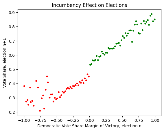
We can try to reproduce this with the sklearn linear regression. If we add a column to the dataframe for \(D\) then we can regress over this to find the values. Furthermore we can plot the result on the graph to see how well it fits.
Code
from dataclasses import dataclassimport numpy as npfrom sklearn.linear_model import LinearRegressiondef calculate_regression_1(step: float=0.01) ->None: df = load_data() df["D"] = df.won.apply(float) X = df[["x", "D"]] y = df.y reg = LinearRegression().fit(X, y) intercept = reg.intercept_ x_coeff, d_coeff = reg.coef_def to_y(x: float) ->float: y = intercept + (x * x_coeff)if x >=0: y += d_coeffreturn y lost_df = pd.DataFrame([ {"x": x, "y": to_y(x)}for x in np.arange(-1, 0, step) ]) won_df = pd.DataFrame([ {"x": x, "y": to_y(x)}for x in np.arange(step, 1+ step, step) ]) ax = plot_results(df, c=df.won) lost_df.plot.line( x="x", y="y", c="blue", legend=False, ax=ax, xlabel="Democratic Vote Share Margin of Victory, election n", ylabel="Vote Share, election n+1", ) won_df.plot.line( x="x", y="y", c="blue", legend=False, ax=ax, xlabel="Democratic Vote Share Margin of Victory, election n", ylabel="Vote Share, election n+1", )return to_y(0) - to_y(-step)
Code
difference = calculate_regression_1()print(f"incumbency effect is {difference *100:0.3f}%")
incumbency effect is 8.946%
We can see that there is a clear step here, and our calculated incumbency effect is around 9%. The two lines appear to be slightly off. It’s likely that this is due to the linear regression being a poor fit for the actual data.
Either way, this has shown a difference which we were able to estimate ahead of time. Seems like a neat technique.